Logo Development
The development of the Green Fund logo focused on creating a simple yet powerful representation of sustainability at NMU. The design team aimed to balance the concepts of growth and community with NMU’s distinct identity. Starting with the idea of a leaf—a universal symbol of nature and regeneration—the team incorporated clean, geometric lines that also form the letter “N” in the negative space, linking the logo to the university. This minimalist and modern approach ensures the logo is versatile and instantly recognizable, fitting seamlessly into various campus materials and communications, from educational resources to promotional campaigns.
2022 and 2023 Project Signage
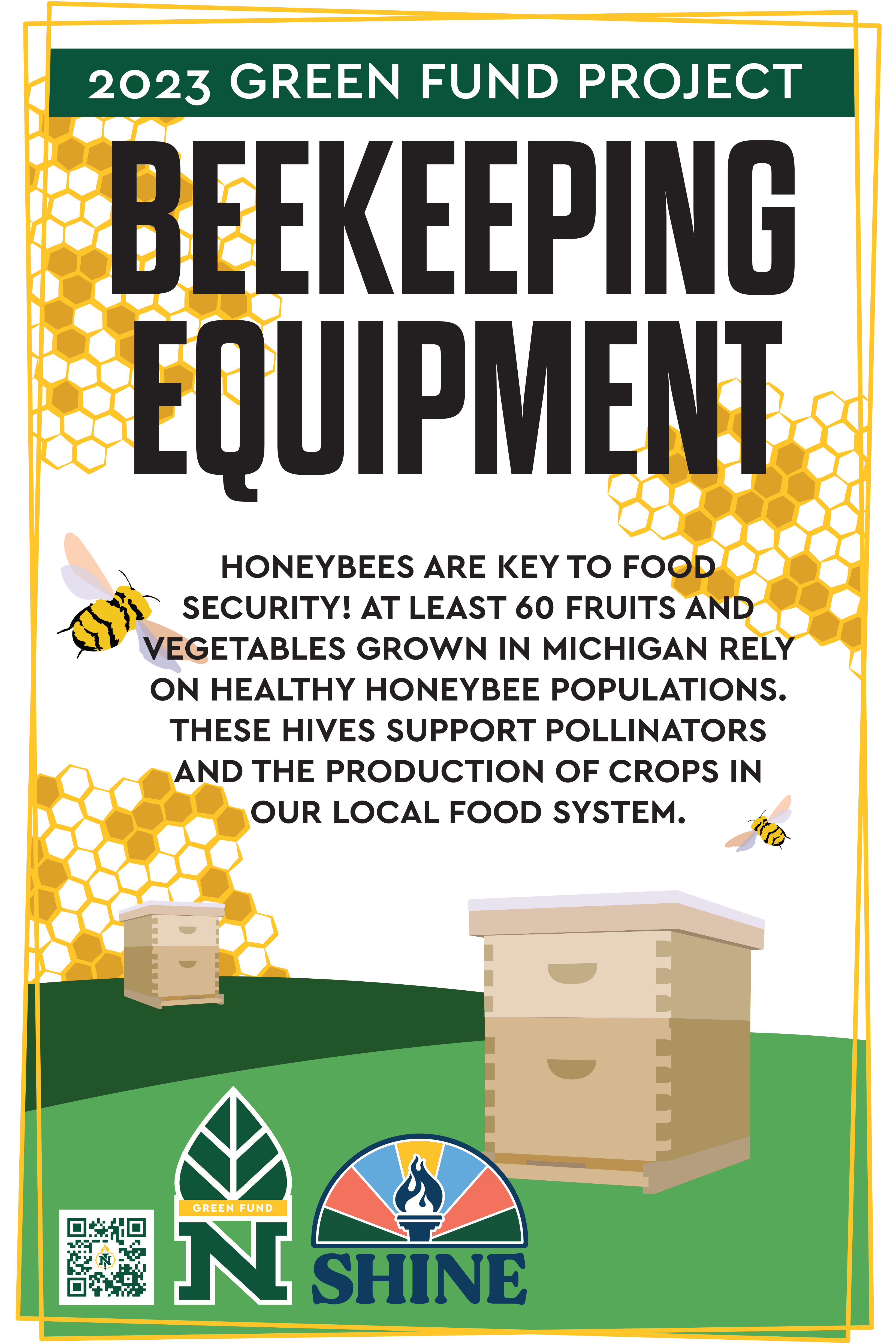
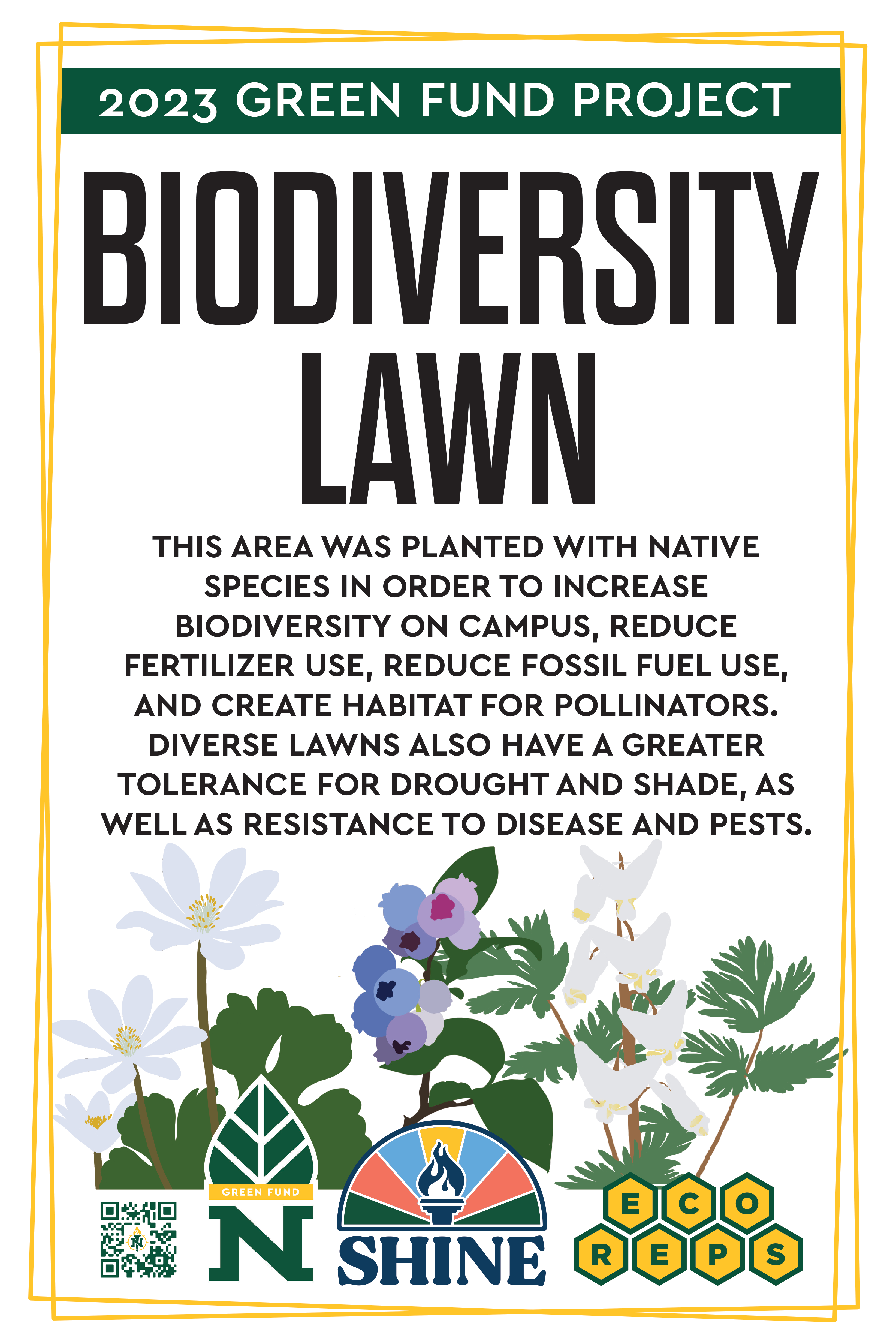
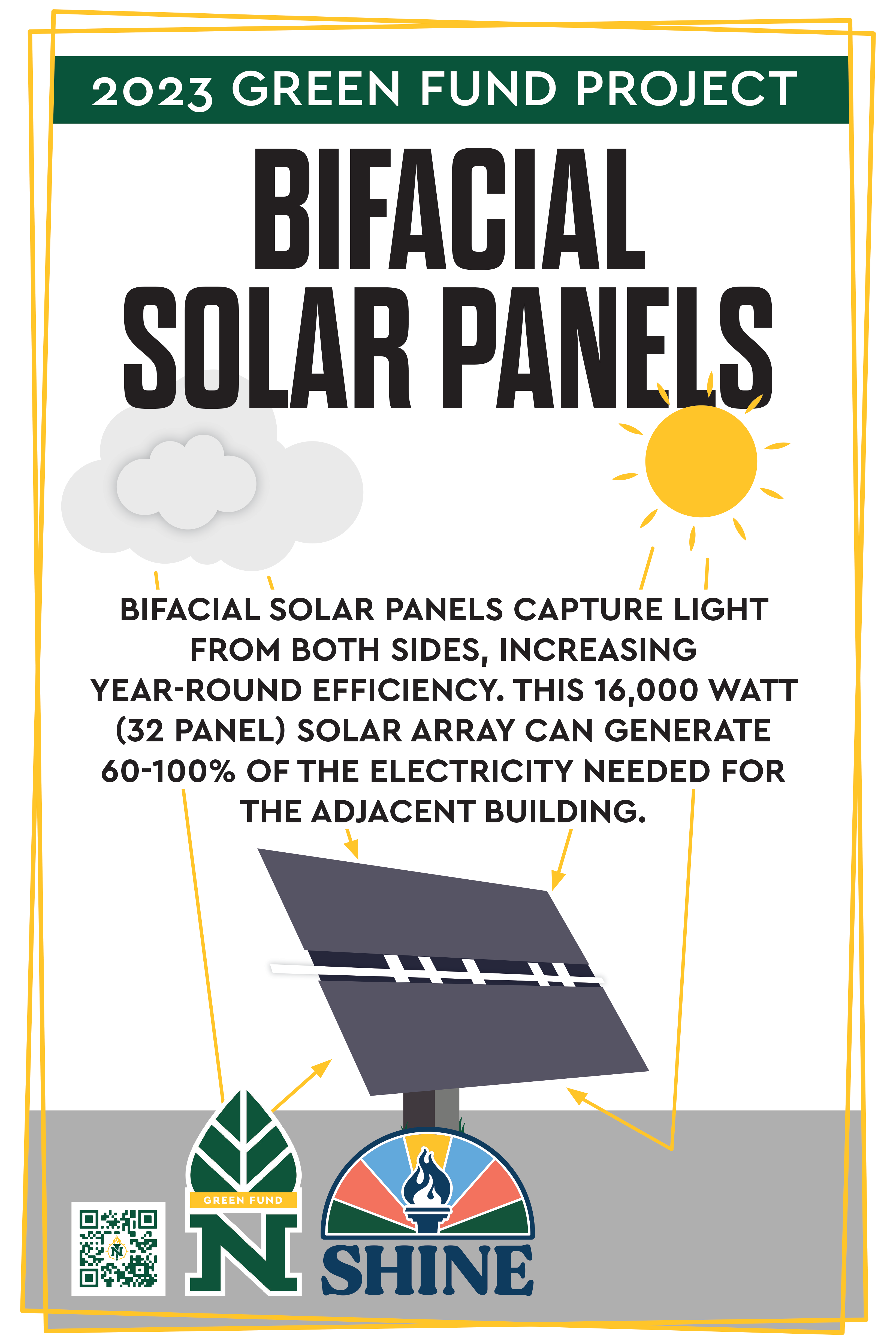
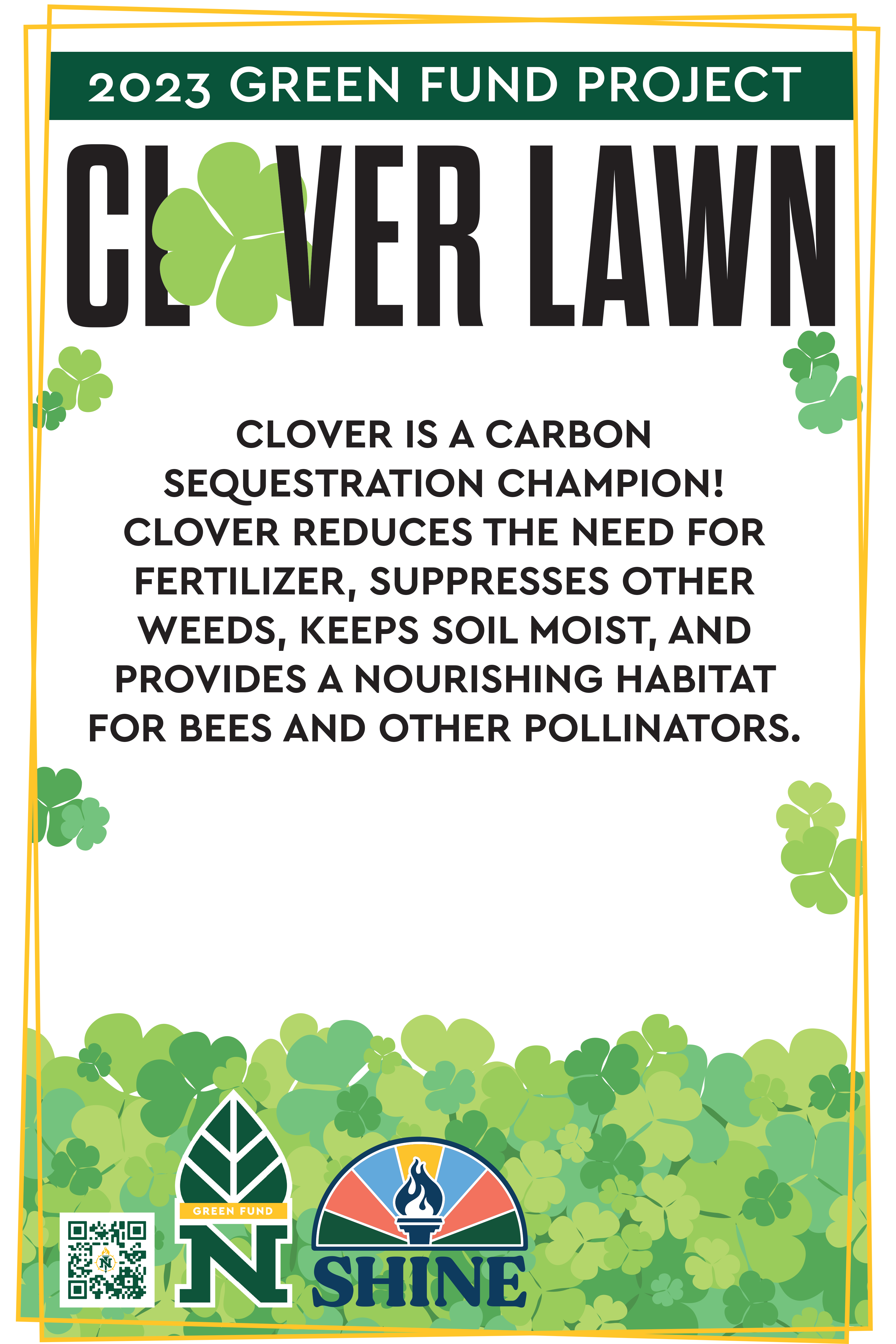
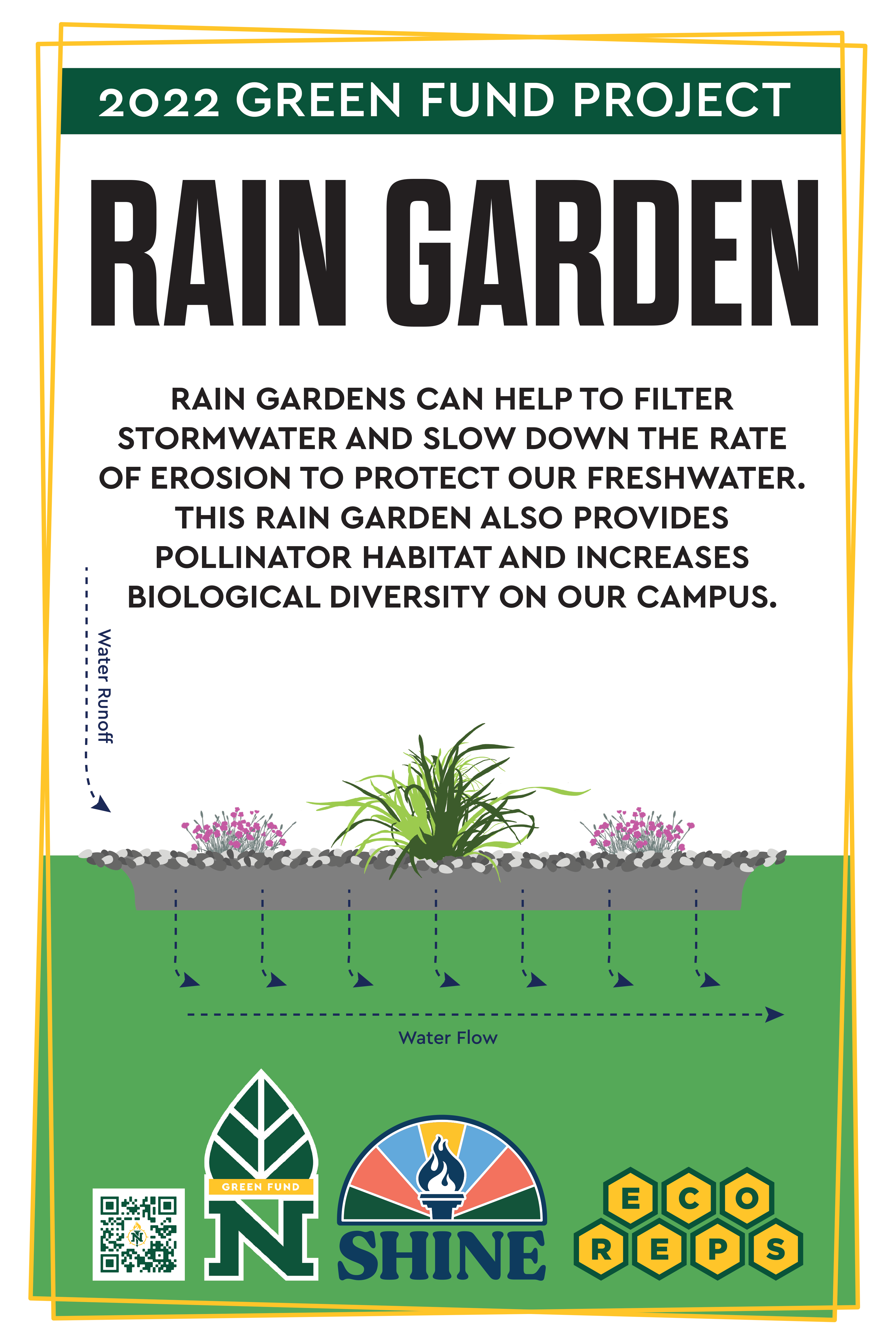
The signage for each Green Fund project was designed with clear, impactful messaging to emphasize the unique environmental benefits of each initiative. Key points were identified for each project—such as the carbon sequestration benefits of the Clover Lawn and the educational impact of the Beekeeping program—ensuring that each sign served both to inform and inspire the NMU community.
To maintain a cohesive visual identity, consistent design elements were used across all signs, including the “Green Fund Project” banner, NMU branding, and bold, accessible titles. This approach allowed each project’s signage to be easily recognized as part of NMU’s broader sustainability initiative, reinforcing the Green Fund’s mission on campus.
Graphics were thoughtfully incorporated to visually explain the function of each project. Simple icons and illustrations—such as water flow arrows on the Rain Garden sign and solar panel diagrams on the Solar Array sign—helped convey complex environmental processes in an accessible way. By balancing text and visuals, each sign communicated essential information while remaining easy to read, with an emphasis on durability and accessibility to ensure each sign could be viewed comfortably outdoors by all members of the community.